
Tomatin Distillery has unveiled a new packaging design for its core single malt range, a move it claims is the ‘final piece of the puzzle’ in establishing its identity.

The Inverness-shire distillery embarked on a strategy in 2014 to reposition the brand as a ‘softer side of the Highlands’, in a bid to stand out in the ‘saturated single malt market’.
The new look for Tomatin’s core range is designed to reflect the change in direction for the brand, the new identity for which uses ‘earthier colours’ and a more contemporary logo.
Tomatin’s bottle has also been overhauled, dropping its tall, slender design in favour of a shorter, broader shape that’s embossed with the outline of a Highlands landscape around the base, and the words ‘The Softer Side of the Highlands Since 1897’ around the shoulders.
The update has been applied to The Tomatin Legacy, 12 Year Old, Cask Strength, 14 Year Old and 18 Year Old bottlings.
Jennifer Masson, marketing manager at Tomatin, said the redesign represents an ‘incredibly exciting and important time’ for the brand.
‘Over the past few years we have invested a lot of time in rediscovering our distillery, our people and our values,’ she said.
‘We now have a far stronger voice and sense of identity and our rebranded packaging is the final piece of this puzzle in place.’
Tomatin has created a new marketing campaign, Tomatin Life, to support the roll-out of its redesign.
Tomatin distillery also produces the Cù Bòcan and Antiquary brands.
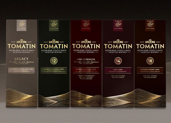 The redesign has been applied across the Tomatin core range


